Coma
— Brand identity
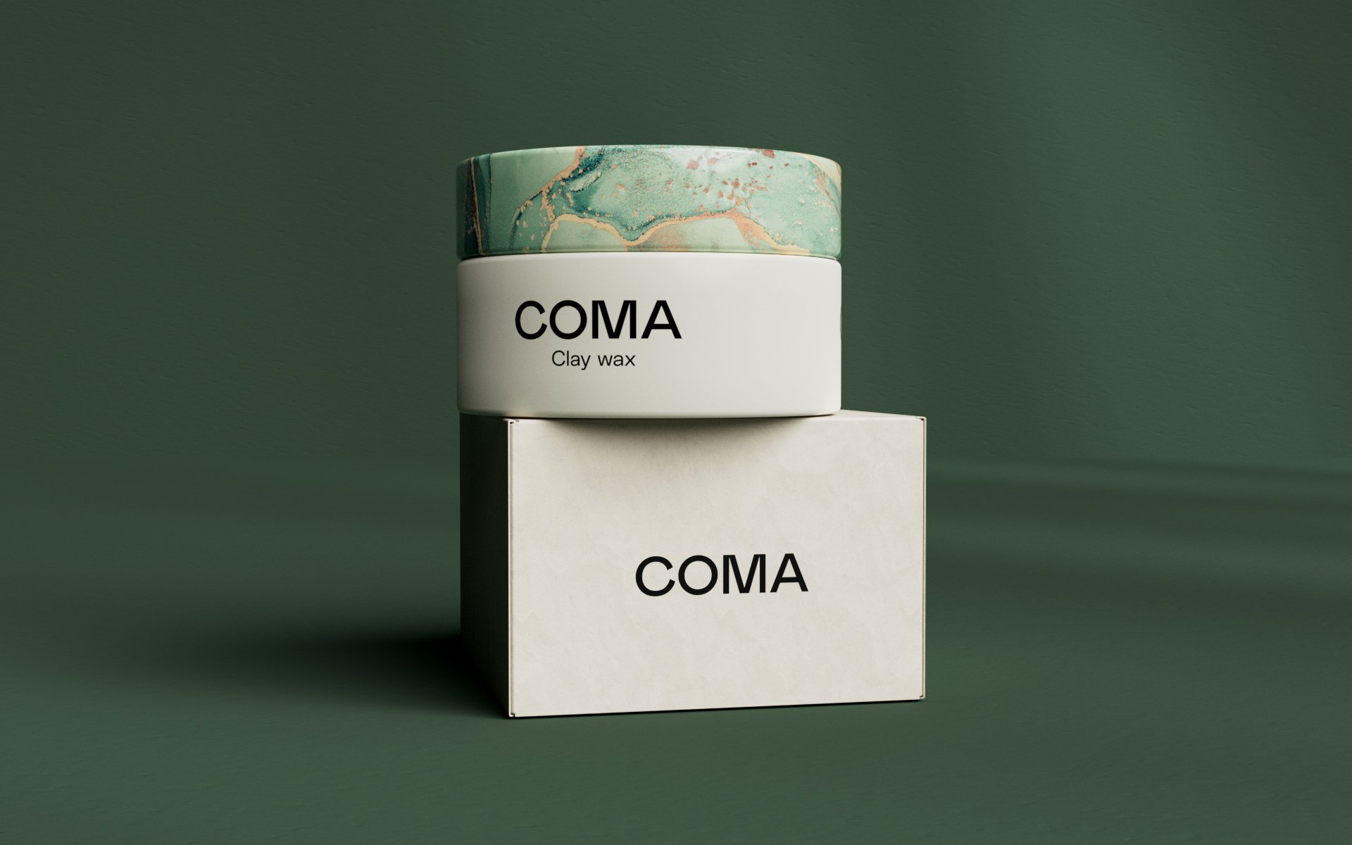
— Packaging system
— Website
— Print
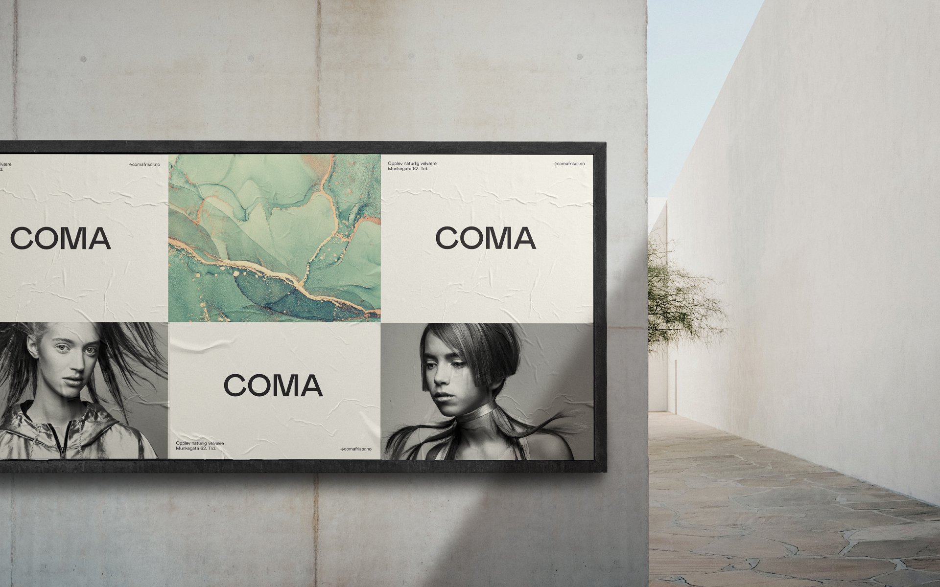
Coma is an award-winning hair studio located in Trondheim, taking a sustainable approach to beauty and wellbeing. By North was commissioned to develop a new visual identity, reflecting their commitment to reducing the carbon footprint of their industry.
The identity’s focal point is inspired by the organic, fluid, and vibrant qualities of alcohol ink. The font of choice is FK Grotesk, a rigid typeface with subtle ink traps and sharp corners that makes it suitable for small text and adds eye-catching details at large sizes. Paired with a generous amount of white space and a clear design system, Comas visual identity is distinctly Scandinavian with an organic, natural twist.


