Mack Spritzer
— Packaging Design
— Design System
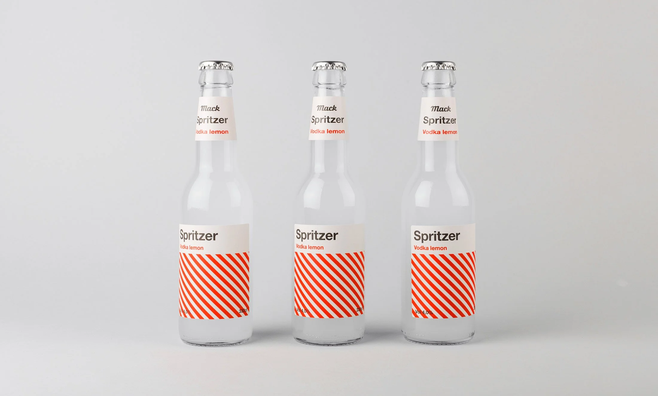
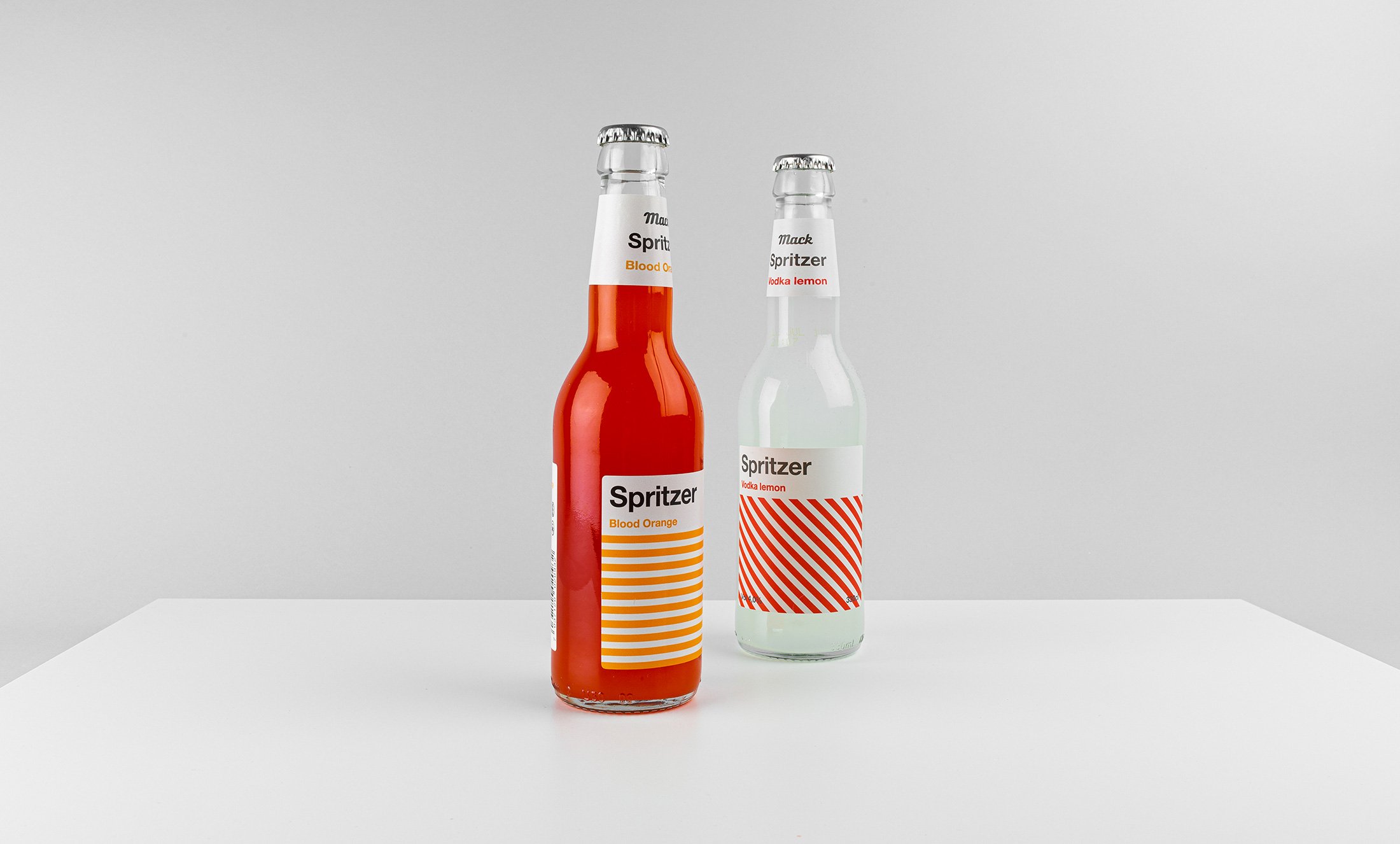
When initiating the branding project for Mack’s new pre-mixed drink series, Spritzer, the brief concluded that the product should appeal to a broad audience through honesty and simplicity. We wanted to position the brand as a choice for those who prefer pre-mix over beer, and want a premium product. The pre-mix category in Norway is characterized by brands focusing mainly on female buyers, with design elements and brand names borrowed from the various producers of spirits. To differentiate Spritzer, we looked for inspiration in the strict European modernism of the sixties. With simple graphic shapes, constrained and timeless typography, and a colour palette that is both muted and clear at the same time, Spritzer makes a bold statement in the store shelves.
Awarded with diploma in Visuelt 2020